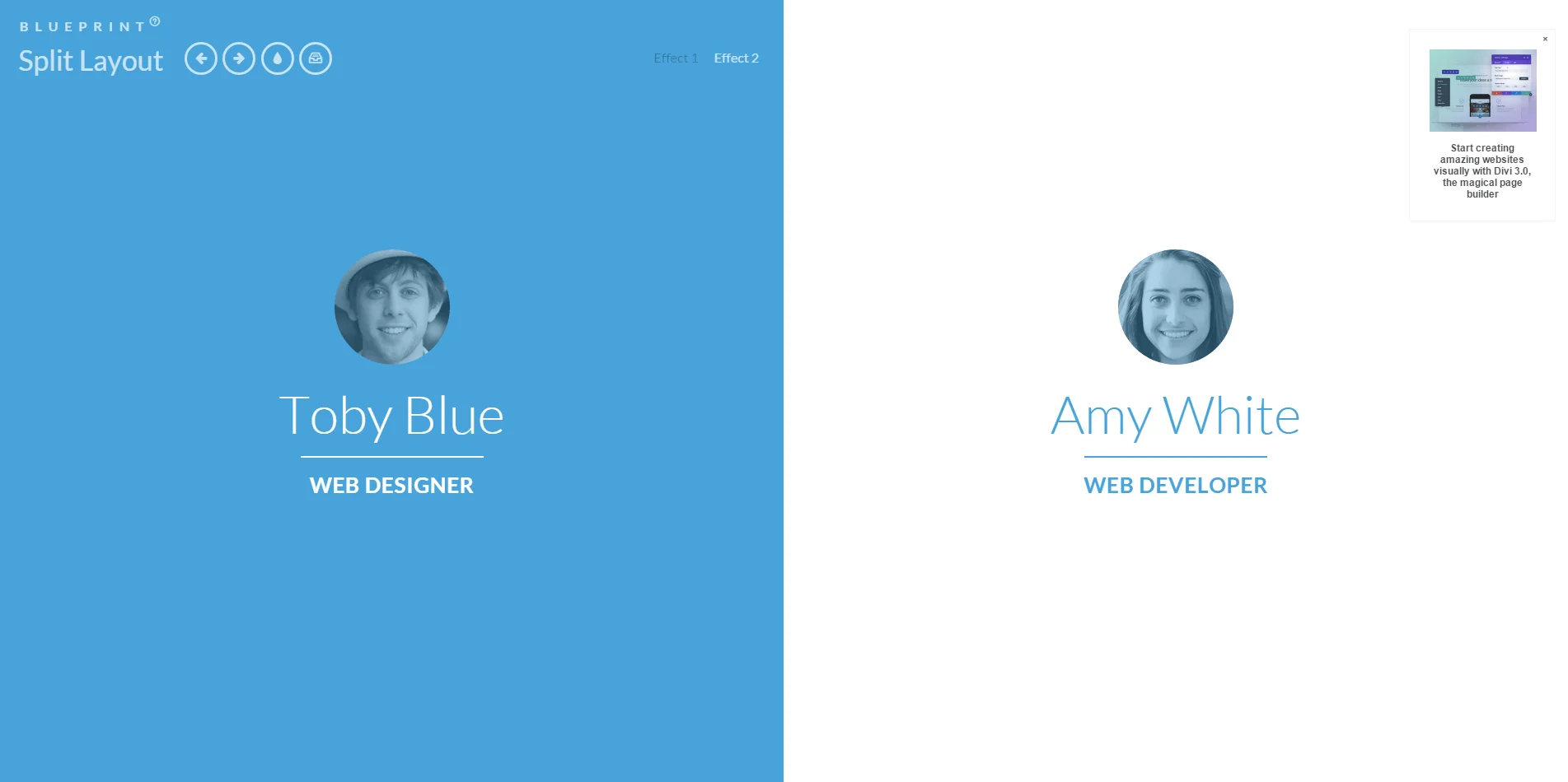
This Blueprint is a layout with two sides, sometimes seen in portfolio websites of couples and partners. The idea is to show an initial two-sided view and when clicking on a side, the whole page transitions into the respective direction. The individual page of the selected person is shown.
The Blueprint comes with some example media queries and a second demo where the disappearing side scales down. It will work in modern browsers (from IE9 on).
这是一个两边拆分的布局,可以用作情侣博客,这个想法是显示一个最初的双面视图,当点击一边时,整个页面转换到相应的方向,显示所选人员的个人页面。
暂无讨论,说说你的看法吧


